Are people who experience hunger more likely than others to think about emigrating? That’s a reasonable assumption, for instance in light of historical examples such as the massive Irish emigration in the wake of famine in the mid-1800s. But the opposite argument is also convincing: people who live from hand to mouth don’t have capacity to think about something as overwhelming and complex as moving to a different country.
The relationship between poverty and migration has preoccupied migration researchers for several decades. Today, the consensus seems to be that, in poor countries, poverty reduction tends to raise migration desires and departures. But behind this generalization there’s complexity that makes it hard to come up with a simple answer.
In this post I show how data visualization can be used to grapple with complexity and come up with new questions for probing deeper into the data.
I’ve used Afrobarometer data from surveys in 33 African countries. More than 44,000 people were interviewed and asked, among other things, whether they have ever gone without enough food to eat during the past year, and whether they have thought a lot about moving to another country.1 Since migration aspirations are generally most widespread among young men, I want to know whether someone who has experienced hunger is more likely to think about emigrating than a person of the same age and gender who has not.
Typical analyses tell simple stories
A typical statistical analysis would combine these variables, apply appropriate weights and controls, and come up with an overall answer. Following this recipe shows that the odds of thinking about emigrating are 13% higher for someone who has experienced hunger than for someone of the same gender, age, and country who has not.2
Let’s use a specific example of what the data shows: If a 25-year-old man who never lacks food has a 23% likelihood of thinking a lot about emigrating, the experience of hunger would raise the likelihood to 26%.3 This is a slight effect, but it is clearly statistically significant. The data has spoken: experiencing hunger makes Africans more likely to think about emigrating.
This simple analysis is actually unhelpful, for two reasons.
Effects are not the same in every society
First, it’s an average that glosses over diversity and risks obscuring the effects that we seek to understand. People in Uganda and Tunisia, for instance, might react differently to hunger. The majority of Ugandans sometimes go without enough to eat, whereas it is relatively rare to do so in Tunisia.4 The people who go hungry suffer all the same, but it might influence their behaviour differently, depending of whether hunger is widespread or exceptional in the place where they live.
Similarly, the idea of emigration is not the same everywhere. In Tunisia, most people know someone who’s moved to Europe. There are many obstacles to doing so, but the prospect of leaving is present in people’s minds. In societies where emigration is rare, and maybe more of an élite phenomenon, those who go hungry are less likely to envision a future abroad.
So perhaps the link between experiencing hunger and thinking about emigrating is not the same everywhere. If so, we shouldn’t seek a simple answer, but rather try to understand how and why the effect differs.5
Statistical significance is misleading
The second reason why the traditional approach falters, is that it’s hung up on ‘statistical significance’. For many decades, researchers have used an arbitrary threshold of uncertainty to decide what counts as a result. That’s rapidly giving way to more nuanced approaches. As an editorial in Nature put it, ditching statistical significance ‘will make science harder, but better’
A typical survey collects data from a small number of randomly selected individuals to get an estimate for the population as a whole. Pure chance adds an element of uncertainty around this estimate. But if the number of respondents is large, the uncertainty shrinks. This is why the slight effect of hunger on thoughts about emigrating would count as statistically significant: it was based on a sample of 44,000 respondents.
Rather that saying that some results are significant while others are not, researchers are now engaging with statistical uncertainty in more open and continuous ways.6
Every result from survey data analysis – such as as the estimated effect of hunger on thoughts about emigrating – comes in two parts:
- A measure of the effect size (whether experiencing hunger makes people more or less likely to think about emigrating, and if so, how much more, or how much less; this can be measured in different ways, including odds ratios, which I use below.)
- A measure of the statistical uncertainty (how likely it is to obtain an estimate of this size if experiences of hunger and thinking about emigrating are unrelated in the population as a whole; this is known as the p-value.)
The essence of the current approach to statistical analysis is to always consider both parts, and to avoid arbitrary cut-off points.
Visualization can help navigate complexity
I have estimated the effect of hunger on emigration considerations separately for each country and obtained 33 pairs of information: an odds ratio that shows how much the experience of hunger increases or decreases the likelihood of thinking about emigrating, and a p-value that shows the degree of statistical uncertainty.
To understand how and why the effects of hunger differ, I’ve taken a visual approach. It’s inspired by my work on the MIGNEX project, especially on the analyses I did together with Jessica Hagen-Zanker, Nicolás Caso, and Marcela Rubio. I’ll introduce the visualization step by step.
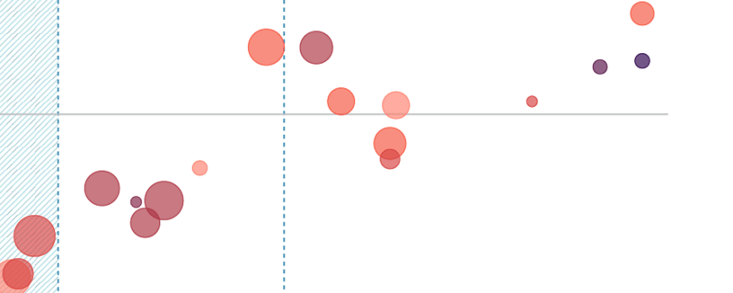
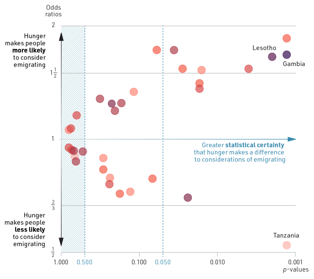
The starting point is to take effect size (odds ratio) and statistical uncertainty (p-value) as the axes in a scatter plot and add a marker for each country. I have used the vertical axis for the effect size, since it is intuitive that big increases and decreases are at the top and bottom of the figure, respectively. So if a country marker is placed near the top, it means that people who’ve experienced hunger are much more likely to consider emigrating than those who have not.
The horizontal axis shows statistical uncertainty. I’ve reversed it, so that it shows increasing degrees of statistical certainty, which seems more intuitive. The axis is logarithmic, meaning that for each step on the axis, the p-value is divided by ten.
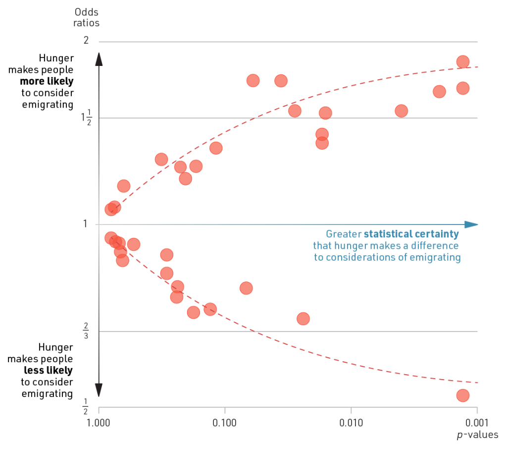
The first thing to note is that the country markers are split quite evenly between the top half and the bottom half of the figure. In other words, hunger makes people less likely to think about emigrating in about half of the countries, and more likely to do so in the other half.
Second, some of the effects are huge. Whereas the average effect for Africa as a whole was a meagre 13% change in the odds, we see that in some countries the odds are almost doubled. Conversely, there is one country where the experience of hunger reduces the odds of thinking about emigrating by about half.
Now, lets consider degrees of statistical certainty. The country markers are scattered along the two dashed curves in the figure. The greater the effect size – whether positive or negative – the greater the certainty that hunger makes a difference. This is as expected, and not really a finding in its own right. So, while trend lines are often seen as the key take-aways from scatter plots, they are the least interesting element here.
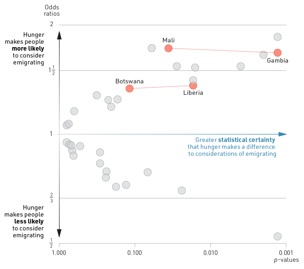
Instead, it’s worth looking at how statistical certainty varies between countries where the effect size is roughly the same. That’s the case with Mali and The Gambia, for instance. The main reason why the result in Mali is much less certain, is that only 11% of Malians are considering emigrating, compared with 29% in The Gambia. This means that the estimated effect of experiencing hunger is based on responses from a smaller number of individuals. As a consequence, it is less certain that the survey data reflects the population as a whole. For the same reason, the effect in Botswana is less certain than the similarly-sized effect in Liberia.
If hardly anyone considers emigrating, or if nearly everyone does so, the results will be very uncertain. The same is true if hunger is extremely common or extremely rare.
The surveys in Mali, The Gambia, Botswana, and Liberia all had between 1100 and 1200 respondents. But in a handful of other countries, the samples were considerably larger. This is another reason why statistical certainty varies, even when effect sizes are roughly the same.
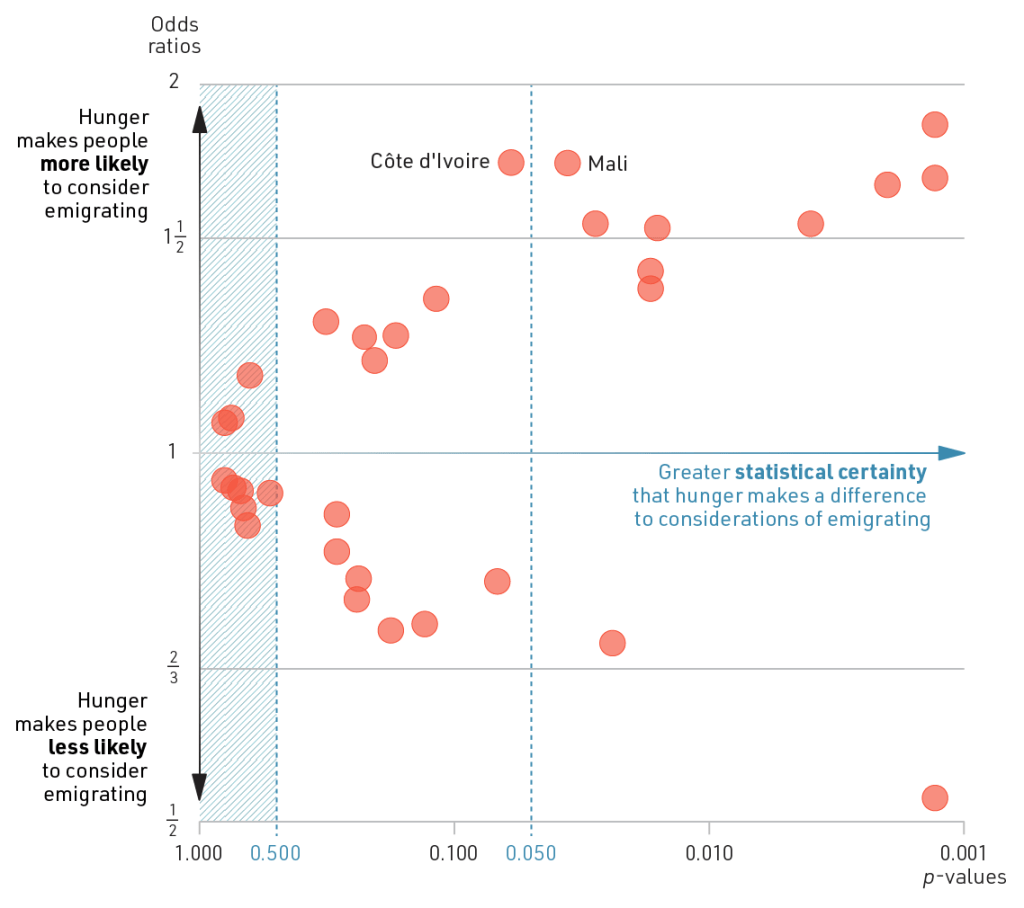
In traditional statistics, a p-value of 0.05 was seen as the cut-off point for being ‘statistically significant’. This level is marked for reference in the figure below. We see that Côte d’Ivoire and Mali are almost adjacent, but on opposite sides of the line. A typical (and misleading) conclusion would be that an effect of hunger on emigration was found only in Mali and not in Côte d’Ivoire. It’s true that it’s slightly more certain that there is such an effect in the Malian population, but it’s a matter of degree.
The shaded area in the figure represents p-values greater than 0.5. Here, the effects are more likely to be coincidental than to reflect an actual pattern in the population. Everywhere else, the best estimate is that there is an effect, though with varying degrees of certainty.
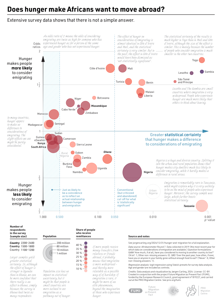
Now let’s start thinking about why hunger seems to inspire emigration in some countries and have the opposite effect in others. One possible explanation is that, in some countries, emigration is already widespread and therefore more likely to come to mind as a strategy for improving one’s life. If, by contrast, hardly anyone emigrates, it seems likely that the people who live from hand to mouth are the least likely to think about it.
To explore this, I have added colour to the markers in the figure below. The Afrobarometer data does not reveal anything about emigration levels, but they do cover reliance on remittances. In countries where many people receive money transfers from relatives and friends abroad, we can assume that emigration is widespread. At one extreme, 47% of people in The Gambia do so. This is represented with a dark purple. At the other end of the color scale, with a pale pink, we find Tanzania, where only 9% rely on remittances.
Comparing these two countries supports the hypothesis. Tanzanians who experience hunger are much less likely than others to think about emigrating. This is hardly surprising, since very few Tanzanians are actually emigrating. At the opposite extreme, The Gambia stands out as a country where those who go hungry are much more likely to consider emigrating. Lesotho -which has many migrant workers in South Africa and large inflows of remittances – is in a similar situations.
Looking beyond the extremes, at all the other markers in the figure, there isn’t a clear colour pattern. So the prevalence of emigration might provide part of the explanation, but it is not the full story.
The Gambia and Lesotho are both small countries (in size and population), while Tanzania is big. It wouldn’t be surprising if hunger makes people in small countries look beyond the borders for a better future while those in bigger countries are less likely to do so. To get a sense of this, I’ve resized the markers and turned the scatter plot into a bubble chart that also shows each country’s population size.
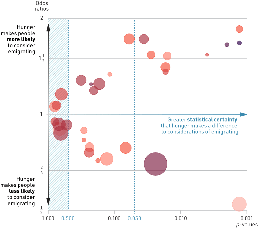
Again, the figure lends some support to the hypothesis. There are many small countries in the top half of the figure and a few big ones in the bottom half. But if we also consider the countries where effects are less certain, the picture is mixed.
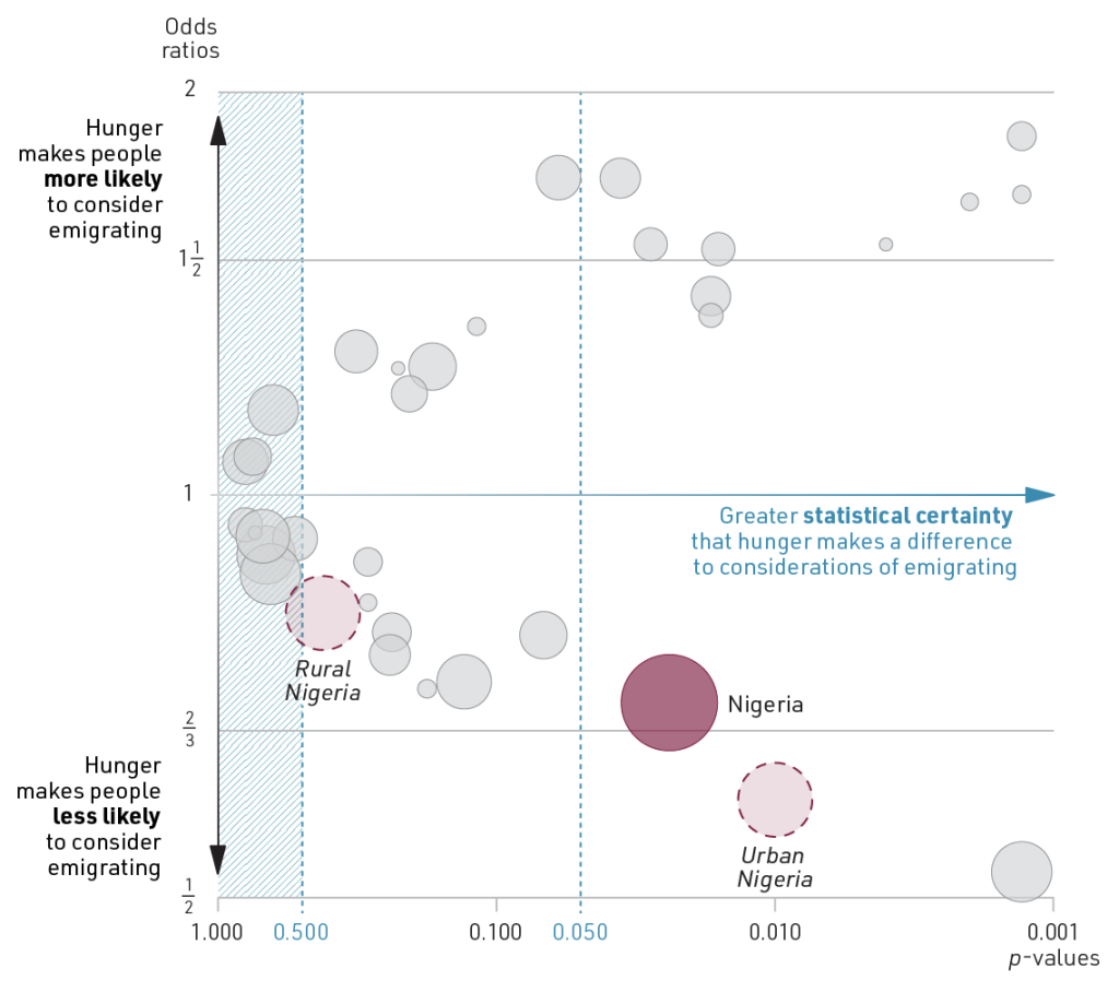
A surprise to me, which stood out as soon as population size was introduced, was Nigeria. Nigerians who experience hunger are considerably less likely to think about a future abroad than those who don’t. This makes sense considering the size of the country, but not in light of the well-established culture of migration. Nigeria comes fourth (after The Gambia, Lesotho and Cabo Verde) in the proportion of people who rely on remittances (30%).
To dig deeper, I reconsidered whether Nigeria is really a meaningful unit of analysis. Yes, it’s a country, but it has more inhabitants than the other 14 West African countries combined. Nigeria’s is also extreme in its diversity, ranging from impoverished war-torn villages to some of the continent’s leading technological and financial hubs.
So, as a start, I split the country into its rural and urban populations, and analyzed them separately. The resulting figure shows that hunger seems to hardly make a difference to emigration considerations in rural areas. In the cities, however, it is a strong and highly certain pattern that people who always have enough food are the ones who also look abroad.
The final figure brings it all together and adds the name of every country. For the most interesting part about bubble charts is often not the overall pattern, but the location of specific bubbles. I am currently doing research in The Gambia, Ghana, and Cape Verde, and their dispersed placement in the figure has given me a lot to think about.
The summary figure also shows (via the styling of country names) where the samples were larger, and it has includes explanatory comments. The figure is available as a PDF to download.
Concluding reflections on hunger and emigration
- On average, Africans who experience hunger are slightly more likely than others to think a lot about moving to another country. This finding reflects how the idea of emigrating has spread far beyond élites.
- The average effect obscures great diversity. In many countries – especially ones that are large, or where emigration is uncommon – people who experience hunger are much less inclined to think about emigrating.
- The visualization generated interesting hypotheses and questions that could be pursued with more complex statistical analyses, and perhaps yield new visualizations.
- Running separate analyses for each country brings out the importance of context. At the same time, it’s a reminder that countries are imperfect units of analysis that can be problematic to compare.
- The case of Tanzania is puzzling. Why hasn’t the idea of emigrating spread in the same way as in most other African countries?
Concluding reflections on data visualization
- Data visualization is a powerful tool for making insights from data accessible to broader audiences of non-specialists. But thoughtful visualizations can also be eye-opening to specialists who have to grapple with complexity.
- Good visualizations should minimize clutter and make the data tell a story, preferably in a self-explanatory way. Sometimes there’s a simple story to tell, while in other cases, the story is more like a multi-layered novel. That doesn’t make visualization redundant, but it calls for more guidance.
- The paradigm shift in thinking about statistical uncertainty opens up new opportunities for data visualization. Bubble charts that intersect effect size and statistical uncertainty, as I have done here, are useful for interpreting results.
Footnotes
- The questions were formulated as follows: Q68A ‘How much, if at all, have you considered to moving to another country to live?’ (‘Not at all’: 0; Other non-missing answers: 1). Q8D ‘Over the past year, how often, if ever, have you or anyone in your family gone without enough food to eat? (‘Never’: 0; Other non-missing answers: 1). ↩︎
- Logit regression including country fixed effects. ↩︎
- Predicted probabilities using the average of country coefficients. Predicted probabilities differ from country to country, but the analysis assumes that the relative effect of experiencing hunger is the same everywhere. ↩︎
- According to the Afrobarometer data, the proportion is 60% in Uganda and 20% in Tunisia. ↩︎
- This realization was a key take-away for me as the leader of MIGNEX, a huge research project on migration and development. We collected data in 26 local communities across ten countries, and much of the analysis focused on understanding how and why the drivers of migration varied. In this context, ‘average’ effects were meaningless, while the (in)consistency of effects was analytically interesting. See Jessica Hagen-Zanker, Jørgen Carling, Nicolás Caso, Marcela G. Rubio (2025) ‘The multi-level determinants of international migration aspirations in 25 communities in Africa, Asia and the Middle East.’ World Development, Volume 185, doi: 10.1016/j.worlddev.2024.106774. ↩︎
- See, for instance, ‘Moving to a world beyond “p < 0.05”‘ (The American Statistician), ‘It’s time to talk about ditching statistical significance‘ (Nature) and ‘Editorial: p-values, theory, replicability, and rigour‘ (Demographic Research) ↩︎
